1.1.5. Colours
As we mentioned already in the lesson Planning Multimedia Projects colours are not rendered in the same way on different monitors. Colours on Windows PC appear darker and more intensive than on a Mac. In addition, different web browsers and plug-ins can interpret colour values differently what means that even on the same monitor, colours may appear differently. (Räber et al. 2003)
Platform
The following pictures show how colours are visualised on Macintosh or PC:
 Colours on Macintosh Colours on Macintosh |
 Colours on PC Colours on PC |
As you can see in the images above, images are brighter on a Macintosh
computer than on a Windows machine. The difference is the ![]() Gamma:
Gamma:
Gamma is the curve that describes how the middle tones of images
appear on a computer. Gamma is sometimes confused with brightness and/or
contrast. Changing the value of the gamma affects the mid-tones while
leaving the whites and blacks unaltered. (Apple Computer Inc. 2001)
On PC's
gamma can be between 2.0 and 2.5 on different machines. On Macs, the default is 1.8, although the Mac OS ColorSync control lets you change
this.
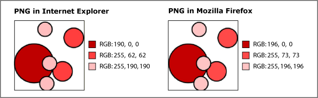
Browser
Even when visualising the picture at top right on one and the same platform but with two browser softwares e.g. Internet Explorer and Mozilla Firefox, the colours are not rendered in the same way. As you can see the colour differences are not visible to the naked eye, but when extracting the colour codes in a drawing software you can see that there is a difference between the colours.
You cannot foresee any of these factors, but according to (2003) there exist a recommendation that can at least partially solve this problem:
Update: 26.1.2012 (eLML) - Contact - Print (PDF) - © CartouCHe 2004-2007 (Creative Commons)
- layout based on YAML![]()