1.1. General Cartographic Representation Rules
Learning Objectives
You will be able...
- ...to name the recommended factor the information density of a paper has to be reduced by for a screen map.
- ...to name the minimum sizes for line and point symbols and the minimum distances of graphical elements for screen maps.
- ...to list at least three criteria that a font for screen maps has to respect.
- ...to give the main reason why colours for screen maps should be clearly differentiated.
- ...to list two methods how to indicate the scale in a screen map.
Introduction
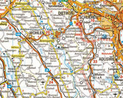
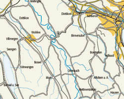
When designing maps for the Internet, cartographers must be aware of basic representation rules that are specific to this medium. In the past, only paper maps, which are normally large-sized (A2 or bigger), existed. Today, in the era of computers, there exist a lot of screen maps. The fact that the size of a screen is more or less constant and as a consequence the space for the visualisation of the map is restricted, causes a few problems. Imagine displaying a paper map whose size is three times the size of a screen: It is obvious that not the whole content of the paper map fits on the screen and that the content of the paper map has to be optimized for screen display.
Therefore, lines, areas and point signatures as well as text labels have to be adapted respectively. Thus, simply scanning a quality paper map for digital display will certainly not lead to a quality screen map.
It is obvious that the content of the map has to be adapted according to the target audience and the purpose of the map!
 Information density on paper map (Hallwag Kümmerly + Frey) Information density on paper map (Hallwag Kümmerly + Frey) |
 Information density on screen map (Brühlmeier 2000) Information density on screen map (Brühlmeier 2000) |
In this unit we give you an overview of the most important considerations that should be taken into account when designing a screen map.
