1.2.2. History of Animated Maps
Animated maps are created by adding a temporal component to a map that displays change in some dimensions. Most commonly the change is shown over time (Wikipedia). An example would be the animation produced after the 2004 Tsunami showing how the waves spread across the Indian Ocean (see last example at the bottom of the page).
History / Development of Animated Maps
The concept of animated
maps began in the 1930s, but did not become more developed by cartographers
until the 1950s (Wikipedia).
In
1959, Norman Thrower published "Animated Cartography" (Thrower 1959). There, he discussed the use of
animated maps by adding a new dimension that was difficult to express in static
maps: time. These early maps were created by drawing
"snap-shots" of static maps, putting a series of maps together
to form a scene and creating animation through photography tricks (Wikipedia).
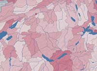
 (data source: © Atlas of Switzerland 2004) (data source: © Atlas of Switzerland 2004) |
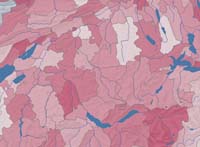
 (data source: © Atlas of Switzerland 2004) (data source: © Atlas of Switzerland 2004) |
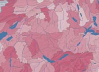
 (data source: © Atlas of Switzerland 2004) (data source: © Atlas of Switzerland 2004) |
With the development of computers in the 1960s and 1970s,
animation programs were developed allowing the growth of animation in mapping.
Walter Tobler created one of the first animations, using a 3-D computer
generated map to portray population growth over a specified time in Detroit
(Wikipedia); (Tobler 1970).
Computing such animations in these early
development stages, meant to have huge computational costs: Computers were slow
and all steps of the animations had to be programmed manually (compared to
today, where it is very easy to create an animated GIF graphic, because there
are programs which do everything for you).
 Screen captures from a 2.5D surface evolution animation. (Schnabel 2008)
Further development in animated map was stalled
until the 1990s due to a lack of animation in academics, financial restrictions
on research, and lack of distribution means. In the 1990s, however, the
invention of faster, more efficient computers, compact discs and the Internet
solved such problems (Wikipedia).
Today, animations are very common in multimedia maps. An example would be the animation produced after the 2004 Tsunami showing how the waves spread across the Indian Ocean:
Animation of Tsunami in 2004 (National Oceanic and Atmospheric Administration (NOAA))