1.2.1. Why Animation in Maps?
Already in the early sixties, Norman Thrower realised the enormous potential of animated maps:
"By the use of animated cartography we are able to create the impression of continuous change and thereby approach the ideal in historical geography, where phenomena appear "as dynamic rather than static entities". Distributions which seem to be particularly well suited to animation include the spread of populations, the development of lines of transportation, the removal of forests, changing political boundaries, the expansion of urban areas, and seasonal climatic patterns." (Thrower 1959)Static Versus Animated Maps
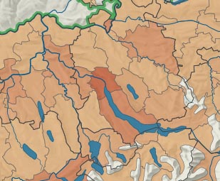
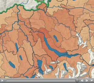
Imagine you have to visualise the changing of the population density in Switzerland between 1950 and 2000 (in steps of ten years).
Not only the listed phenomena are more conveniently visualised with animated maps. There are lots of other possibilities how to use animation in a map. Often, animations are used to point out (highlight) things. The following example shows the highlighting of a state when it is chosen in the selection list. Note, that this example doesn't work in Firefox.


