1.3.2. Graphical Improvements
Symbol
Topographic maps use a wide variety of symbols to represent man made and physical features, for example highways, railroads, gravel pits, buildings, etc. Ideally, all these features should appear on a map in their true proportion, position, shape, and colour. This is however not still feasible because many of the features would be unimportant and others would be unrecognisable because of their reduction in size. Furthermore, some symbols have to be created to represent the man-made and natural features. These symbols look like, as closely as possible to the real features themselves. If this is not possible, a new symbol is created that logically implies the features it portrays. (Räber et al. 2003)
|
For example, a campsite is represented by a small black triangular tent: |
 |
By clicking on the following thumbnail, you reach a graphic that shows the symbols that are used in the National Maps of Switzerland:
 Signatures that are used in the National Maps of Switzerland, reproduced with the
permission of swisstopo (JD072706) (Swisstopo)
Signatures that are used in the National Maps of Switzerland, reproduced with the
permission of swisstopo (JD072706) (Swisstopo)Symbols are positioned on a topographic map in such a manner that the centre of the symbol remains its true location. However, an exception to this would be the position of a feature adjacent to an important road. If the width of the road has been exaggerated, then the feature is moved from its true position to preserve its relation to the road.
Polylines and Polygons
Data that is used for interactive maps is
often prepared in a ![]() GIS software. Since today's GIS softwares are not specialised in
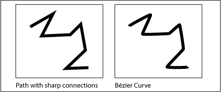
cartography, the resulting maps lack of quality. The joining of two path
segments is not round as it should be in cartographic maps but it is square or
sharp. In addition
GIS software. Since today's GIS softwares are not specialised in
cartography, the resulting maps lack of quality. The joining of two path
segments is not round as it should be in cartographic maps but it is square or
sharp. In addition ![]() Bézier curves are
neither easy to draw and edit in GIS software. The following example shows the
difference between a path with sharp connections and a Bézier curve (you can
hardly see, that the path at the right is a Bézier curve, but if you look carefully
at
the vertices of the path, you can see that they are rounded).
Bézier curves are
neither easy to draw and edit in GIS software. The following example shows the
difference between a path with sharp connections and a Bézier curve (you can
hardly see, that the path at the right is a Bézier curve, but if you look carefully
at
the vertices of the path, you can see that they are rounded).
 Comparison between path and curve
Generalisation
As we already mentioned in chapter Simplification and Generalisation, it is important for topographic screen maps to generalise the data. A common way for not overflowing the screen with data is using the presented "map layer control tools", with whom layers can be switched on and off.
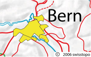
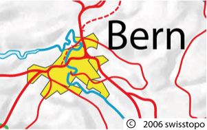
Pay attention on the layer order. If the layer order is incorrect or not well chosen, objects that should be in the background come to the fore:
 Settlement layer is in the front (wrong) (© swisstopo) Settlement layer is in the front (wrong) (© swisstopo) |
 Settlement layer is in the background (right) (© swisstopo) Settlement layer is in the background (right) (© swisstopo) |
