1.4.5. Graphical Improvements
In chapter 1.4.2 Thematic Data we
listed some of the most important representation types for thematic data. For
each representation type we presented an example. Already these examples
demonstrate that it is not easy to visualise thematic data in a pleasing way.
Depending on the data set that is to be visualised and the chosen representation
type, there may occur presentation problems. Imagine to visualise the number
of
inhabitants for each commune around Zurich (divided into two main groups: men
and women which are subdivided into three subgroups: 0-14 years, 15-64 years
and
>64 years). Consider that Zurich has about 300'000 inhabitants in contrast to
the surrounding communes which have only 10'000 inhabitants or even
less.
If we want to visualise these values in a map
using diagrams we could choose between different diagrams. But not all diagram
types are suitable to get a quality thematic map. The following examples show
first some bad results and afterwards some good examples.
(Divided) Bar Chart
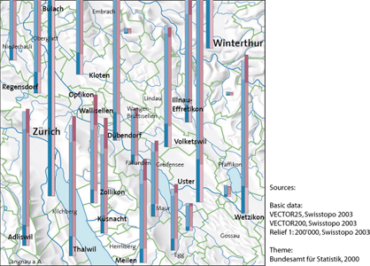
The first example shows the visualisation of
the values with divided bars. There are two main bars: men and women which are
subdivided into the different age categories. Since there are small (below
Winterthur) and huge (Zurich) values, it is not recommended to represent the
values with this representation type. When you look at the bars of Zurich you
can see that not even the first bar fragmentations find entirely place in the
map. It would neither be possible to visualise these bars on the entire screen,
which is a multiple bigger than the presented map, because of the incredible
height of these bars.
In contrast to these huge values, there exist
some small values whose bar fragmentations are hardly recognisable (look at bar
between Wetzikon and Winterthur). Take into account that we did not even
visualise all values in this map. The visualisation of only few values already
causes presentation problems.
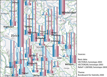
 Histogram, reproduced with the permission of swisstopo (JD072706)
The same problems as above occur when using a histogram as representation type. The values of Zurich are huge and not visualisable anymore. Small values as well are neither visualisable because we cannot recognise them anymore. Since this sort of diagram needs a lot of space (each diagram consists of six bars), it is even more complicated to find an appropriate visualisation. The histograms cannot be placed inside their commune borders, because of their size. As a consequence, the affiliation of the diagrams is not clear anymore what confuses the users. Additionally, if you want to visualise the values of each commune, it is not possible to avoid their ovelapping. We conclude that this diagram is not suitable for the given values, because the result is not satisfaying.
 Divided Bar Chart, reproduced eith the permission of swisstopo (JD072706)
Neither the representation with bar sequences leads to a good map result as you can see in the map below. The huge value differences lead to the same visualisation problems described above. Huge values need a lot of space while small values are not recognisable anymore.
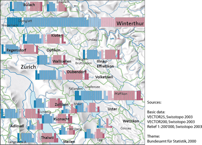 Bar Sequence, reproduced eith the permission of swisstopo (JD072706)
Divided Wing Chart
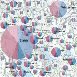
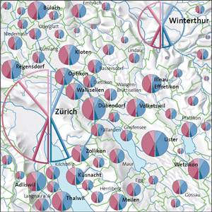
The given values are best visualised with divided wings, since within this method, the sector areas are compared and not, as in the examples above, the bar heights. As you can see in the example below, we are able to visualise all values of each commune. The values of Zurich and Winterthur, of course, are still the largest ones. Therefore, the areas of those sectors are the largest ones and we still cannot avoid an overlapping with other diagrams.
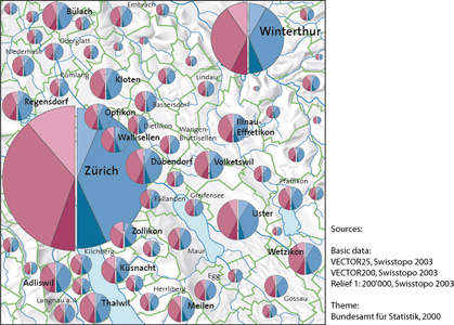 Divided Wing Chart, reproduced eith the permission of swisstopo (JD072706)
As you can see, the diagrams of Zurich and Winterthur cover a big part of the basic map so that e.g. the commune borders are not recognisable anymore. Therefore, we advice to either give these huge diagrams a transparency factor or to design them totally transparent and give them a coloured, expanded stroke. Have a look at the following examples to get an impression of these possibilities.
Conclusion
Depending on the values that are to be visualised and the chosen representation type, there may occur some visualisation problems. Always try to find the best representation type by taking into account that you want to produce a quality thematic map, that follows the cartographic principles.
The aspects we presented above are for both paper and screen maps. So far, we only treated static screen maps. In chapter 1.4.7. Interactivity in Thematic Maps you will get to know a few interactivities that can be implemented into thematic screen maps. Implementing such interactivities into a thematic screen map can reduce some of the presented visualisation problems.

