1.4.2. Presentation of Thematic Data
As you have seen in chapter Thematic Map
Types there are two different thematic map types: qualitative and
quantitative.
Qualitative
maps contain, as the name indicates, qualitative features.
Qualitative feature describe types, kinds or properties of spatial data. They
are of a nominal scaling whereas the ordering of data is based on equality or
inequality between groups. Thus rivers can be distinguished from roads, deserts
from forests, etc. Qualitative data can be visualised by point, line or area
symbols, whereas points are normally represented by point symbols, lines by line
symbols and areas by area symbols. (Asche et al. 2002)
 Symbolisation for qualitative maps (Asche et al. 2002)
Quantitative maps contain quantitative attributes which relate to the values, magnitudes or intensities of numerical data which are expressed in a numerical form e.g. the number of inhabitants of individual settlements (Asche et al. 2002). Quantitative data can either be absolute (e.g. inhabitants of a commune) or relative (e.g. population density of a commune). The decision on how to visualise quantitative data, depends on several aspects as you can see in the following illustration:
 From data to a thematic map (Hurni et al. 2005)
First of all we have to decide whether to visualise one attribute, such
as inhabitants of a commune, or several attributes, such as inhabitants of a
commune subdivided into male and female. If we visualise only one attribute we
have to find out whether the attribute is relative or absolute.
The
following paragraphs explain in a few words the representation types that may
be
used to visualise the data.
Continuous Representation of Data Amounts
|
Criteria for this representation type: |
|
Maps with continuous representation of data amounts portray correct data relations, because each measured value is visualised.
There exist several methods to visualise a continuous representation of data amounts. Three of them are presented next:
| Method | Example |
|---|---|
|
Choropleth Map
Disadvantages:
|
 Exact values are visualised in the map (Allen et al. 2001) Exact values are visualised in the map (Allen et al. 2001) |
|
Proportional Symbol
Disadvantages:
|
 One symbol is defined whose size is variable (Allen et al. 2001) One symbol is defined whose size is variable (Allen et al. 2001) |
|
Repeated Symbol
Disadvantages:
|
 One unit is defined to visualise all values (Institut für Länderkunde 2000) One unit is defined to visualise all values (Institut für Länderkunde 2000) |
As you can see in the presented maps, there may occur a few problems
using the continuous representation of data amounts in screen maps because this
representation type needs a lot of space.
Representation with Intervals
|
Criteria for this representation type: |
|
Classification of data leads to a loss of detail because the exact numercial data relations are not visible anymore. (The theory of how to classify data is explained in the next chapter.)
The representation with intervals can be used for relative and absolute attributes:
| Attribute Type | Representation Type | Example |
|---|---|---|
|
Relative |
Choropleth
Map
Disadvantages:
|
 Interactive choropleth map (Schnabel 2008) Interactive choropleth map (Schnabel 2008) |
|
Absolute |
Graduated range of geometric /
pictorial symbols or characters
Disadvantages:
|
") Representation with geometric symbols, reproduced with the permission of swisstopo
(JD072706) Representation with geometric symbols, reproduced with the permission of swisstopo
(JD072706)") Representation with pictorial symbols, reproduced with the permission of swisstopo
(JD072706) Representation with pictorial symbols, reproduced with the permission of swisstopo
(JD072706)") Representation with characters, reproduced with the permission of swisstopo (JD072706) Representation with characters, reproduced with the permission of swisstopo (JD072706) |
|
Absolute |
Flow Chart (for directional
topics)
Disadvantages:
|
 Flow Chart (Allen et al. 2001) Flow Chart (Allen et al. 2001) |
Representation with Diagrams
There is a huge amount of diagram types than can be used for the visualisation of thematic data. We will only introduce the most popular ones. If you want to get familiar with other diagram types have a look at the pdf file "Diagram Types" (in german).
The most important diagrams within the field of cartography are the following:
| Diagram Type | Example | Advantages/Disadvantages |
|---|---|---|
|
(Divided) Wing Chart |
 |
Advantages:
|
|
(Divided) Bar Chart |
 |
Advantages:
|
|
Area Chart |
 |
Advantages:
|
|
Pie Chart |
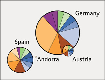 |
Advantages:
|
If you are interested in more information about methods that are used to represent thematic data, have a look at the following e-learning lesson: Thematic Cartography.
Update: 26.1.2012 (eLML) - Contact - Print (PDF) - © CartouCHe 2004-2007 (Creative Commons)
- layout based on YAML![]()