1.1.2. Displaying Content
Coping with Small Displays
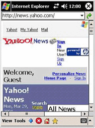
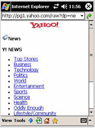
Handheld devices are characterized primarily by a limited display size. If we look at a standard web page which is optimised for normal desktop computers like the Yahoo News page. Graphics, in the form of logos, icons, frames, and images, both increase page load times and unnecessarily occupy this limited space. Thus forcing the relevant information to the outskirts of the display area. In the following two screenshots the differences between device-optimized and non-optimized presentation of content can be seen:
 non-optimized device content non-optimized device content |
 optimized device content optimized device content |
Maps on Small Displays
The web page example above applies also for displaying maps on small displays. In the following example you can test how much content can be displayed at once on a PDA screen. Just change symbol numbers and symbol sizes by dragging the green buttons. Evaluate how big a symbol has to be for being recognisable and then how many symbols can be shown on a map in order to keep the map readable. Keep in mind that also the background map, containing roads and buildings has to be readable.
